


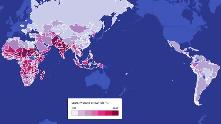
Every day, tens of millions of children around the world go to school or to bed hungry. Not only does it take a heavy toll on their studies, harming their chances at a better life, it also makes them more susceptible to illness and disease, and stunts their growth.
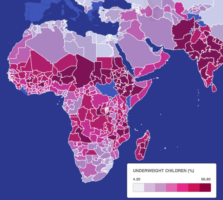
This map, created by journalist Tim De Chant, shows the percentage of children in each country whose weight is “more than two standard deviations below the median of the NCHS/CDC/WHO International Reference Population.” Basically an indicator of where children are chronically hungry.
The map depicts the percentage of children who are dangerously underweight due to malnutrition. It is difficult to calculate just how underweight these children are without knowing the variation in weight in the sample population. De Chant used data from 1990 to 2002. Countries in blue indicate no data was available.
Some key points:
- Underweight and malnourished children are most prevalent in parts of Africa and India
- Half of children in dark red countries are dangerously underweight due to malnutrition
- In parts of Sudan and Niger, half of all children suffer from malnutrition
- A red belt stretching from Africa through India encompasses tens of millions of children who are very underweight
- Parts of Pakistan and India have proportions of underweight children as bad as or worse than war-torn regions of Africa
- Many of the regions experiencing highest population growth are also the ones suffering the highest rates of child hunger

Finally, here is a list of the top ten countries where the number of children under five who are severely underweight is highest (according to UNICEF):
|
# 1 |
18% |
|
|
# 2 |
17% |
|
|
# 3 |
16% |
|
|
# 4 |
15% |
|
|
# 5 |
14% |
|
|
= 6 |
13% |
|
|
= 6 |
13% |
|
|
= 6 |
Laos: |
13% |
|
= 6 |
13% |
|
|
= 6 |
13% |


0 User Comments