


Here's an image that gives you an idea of the size of China's population and the pressure it asserts on the nation's land and other natural resources.
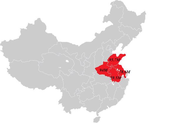
This map, shared from the Amazing Maps Twitter account last week, shows how the entire population of the United States might fight into China, based on the populations of Jiangsu, Shandong, Anhui and Henan provinces.
If you put together Henan's 94 million people, Shandong's 95.7 million, Anhui's 59.5 million and Jiangsu's 78.6 million, it adds up to 327.8, well in excess of the US population of some 320.2 million. (Note: Chinese figures are based on 2010 census, so current numbers are even higher.)
It's a compelling contrast between the two nation's demographics - but it doesn't tell the whole story. Sure, that's one way you could fit the whole stateside population into China, but here's another:
SEE MORE: This WWII-era map of China just might change the way you view the country
Unlike the United States, China isn't fortunate enough to stretch from coast to coast. Instead, the vast majority of the population is crammed against the eastern seaboard and along the mostly mountainous country's sparse plains.
On the bright side, however, the PRC's 9.6 million square kilometers aren't all as hellishly overcrowded as the first map makes out.
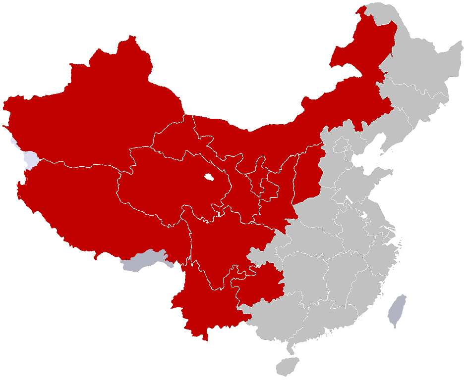
In 1935, National Central University geographer Hu Huanyong imagined an invisible line cutting across China, dividing 94 percent of the population from the other six.

Stretching from Tengchong in Yunnan to Heihe in Heilongjiang, on the Russian border, the "Heihe-Tengchong Line" leaves 57 percent of the national landmass in the western portion, where just four percent of people live.
Despite mass migration of Han Chinese to the far west after 1949 and the exemption of minority peoples from planned birth policies, in 2002 still only 6 per cent of the population was in the west.
If the time comes when we really do have to stuff every American into China's borders for some horrific reason, the second option would definitely be preferable.
INFOGRAPHIC: How the world would look if countries were scaled according to population


0 User Comments